The public Global Fleet & Trade website has been visually standardised and given a calmer, clearer presentation.
The aim of this step was to make the individual pages feel less like separate drafts and more like parts of one connected maritime project world. The home page, information areas, navigation, forms and content pages now follow a shared visual direction.
Particular attention was given to calm readability. Spacing, font sizes, headings, borders, buttons and image areas were coordinated more effectively. This creates a more even overall impression that better suits the atmosphere of a historical trading and harbour world.
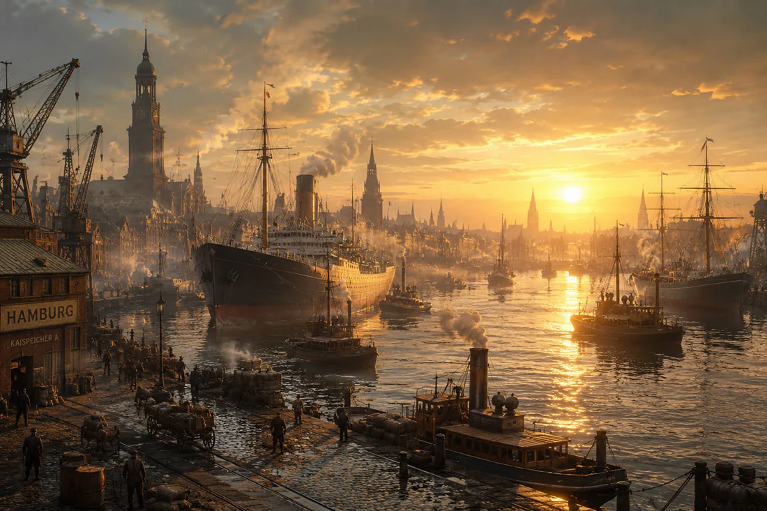
The colour scheme has also been refined. Dark maritime surfaces, warm gold tones and subtle lines now form the visual framework. The website therefore feels less like a technical construction site and more like the public entrance to the world of Global Fleet & Trade.
This step was important because the public project website should eventually do more than provide information: it should also convey trust and atmosphere. Visitors should already sense from the website that an independent trading world is taking shape behind the project.
The unified interface creates a stable foundation on which future areas such as news, changelogs, development reports, game information and later community content can be built cleanly.
Public website given a consistent visual identity